
Capturing the magic of Midnight at the Houdini 🗝️✨
It's been a long journey, but I'm excited to finally share my process for designing the book cover for Midnight at the Houdini by Delilah S. Dawson.
Designing this cover was an enchanting experience from the start. The project's brief instantly drew me in: to capture the vibe of the book through a vintage lettering piece (imagine a mysterious hotel, secrets nestled in shadows, and a bunch of curious teens).

About The Book
A girl discovers a surreal hotel where no one ever leaves. When the clock strikes midnight, she’ll be trapped there forever unless she’s able to break free from magic that in turn breaks all her rules. Perfect for fans of Caraval and The Starless Sea!
Life has gone according to plan for Anna—she stays in the background, letting her sister, Emily, shine in the spotlight. But on Emily’s wedding night, Anna learns that her sister is moving away, abandoning her—and all their shared dreams. Devastated, Anna leaves the reception in the middle of a raging storm, taking shelter in a hotel she’s never seen before: the Houdini.
The Houdini is a hotel unlike any other, with sumptuous velvet couches, marble tiled floors, secret restaurants, winding passageways, and an undercurrent of magic in the air. And when Anna meets Max, who has lived his entire life inside its walls, she’s captivated. For the first time in her life, Anna is center stage, in a place that anticipates her every desire, with a boy who only has eyes for her.
But there’s a terrifying secret hidden in the Houdini. When the clock strikes midnight, Anna will be trapped there forever unless she can find a way to break free from its dreamlike magic. But will she be able to do it if it means leaving Max behind?
Enchanting, mysterious, and utterly fantastic, Midnight at the Houdini will cast its spell on you.
Getting into the book's world, I doodled ideas to channel that magical theme. Playing with fonts and layouts, I aimed for a design that screamed "intrigue."
Following the brief, I provided 4 concepts to choose from around these ideas:
- A vintage hotel key
- A double door that looks like the entrance to the Houdini hotel
- A deck of playing cards
- A floor tile / mosaic-style piece that looks like the floor of the Houdini hotel
The colours? Think deep, enchanting shades that match the book's magical feel.
Crafting this cover allowed me to merge storytelling with hand lettering, inviting readers into a world of mystery before they even open the book.
Initial Concepts


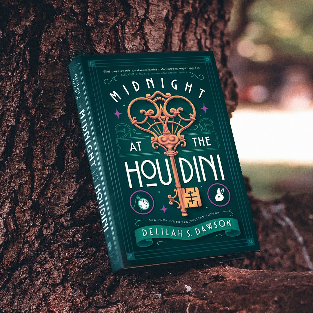
First concept: To draw “Midnight at the Houdini” around one object referenced in the book, for example, an old key. This concept is more illustrative and symmetrical with flat colours. It could incorporate any element from the book (for example a rabbit). The bottom banner would have the author’s name on it or any other information.
Second concept: To draw "Midnight at the Houdini" as a realistic vintage sign on a hotel front door. The entrance to the hotel would feature an arch, doors, and columns with a lot of depth, shadows, and realistic colours.
Third concept: To draw "Midnight at the Houdini" on a playing card. The symbols that normally appear in top left and bottom right corners of a card game would be elements from the book (a rabbit, a key, moon etc.). The decorative elements that frame the lettering would be mirrored at the top and bottom.
Fourth concept: To draw "Midnight at the Houdini” as a floor mosaic in an Art Deco lettering style. The tiles would cover the entire page with some filigrees as decorative elements to balance the lettering composition.
Proposed Colour Palettes


For the colours, I've decided to present 2 different options, both using complimentary colours to really bring out the main element of the design, which is the key.
The goal of this step was for the client to pick their preferred colour palette, so I didn't include highlights or shadows.
Revisions


The client picked the 2nd colour palette and asked to add a fuschia as an accent colour for the decorative elements.
After getting some feedback from the client, we've decided to tone down some of the highlights to give it a more sophisticated look that would appeal to both young adult and adult audiences.
The Final Result
I'm so pleased with the final result, even though I wish I could have seen all those initial concepts brought to life! I think this book cover complements the story very well, and maybe I'll get to work on a sequel in the future ;)

Excited to bring your own story to life with a captivating cover?
Let's team up and make some magic happen together ✨📖
REQUEST A BOOK COVER